For my reflection of my work I think I did a good job achieving what wanted to do something that worked with my museum style and still separated itself a little from that minimalistic style I think I achieved this in my work having vibrant colours a visually interesting design that linked to the medium and having fun features like the opening parallax and the pinch and scroll map in the navigation of the app.
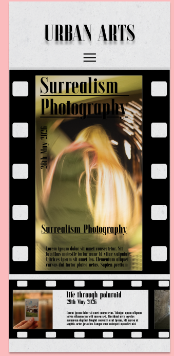
My best page I think is my Events page it captures what I wanted to with this app design it features the visually appealing film reel graphic and the horizontal scroll elements that allow the user to scroll through the different events after their attention is caught by the big event on the centre of the screen. the main photo incorporates a small bit of the pink to jump out at the users and the first scrolling event has the warm tones in the colour scheme.
Changes
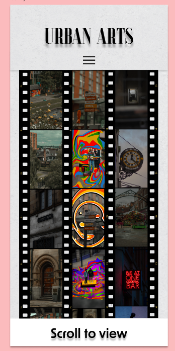
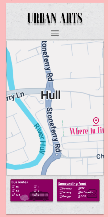
If I were to design my app again I think I would change some things to make it better firstly I would change the gallery I think I want the gallery to incorporate both vertical and horizontal photos, instead of having a scrolling feature I think I would have a pinch and zoom where you could swipe round and look at all the photos laid out having it be a much bigger area with more photos then in the final version. Map, for the map I would fix the information boxes I think that while they are okay and work well I would want a better integration into the page for the information maybe making them a drop down or a separate page. Finally I would have more palette integration I would like more of my colour pallette to be used and to be varied I think these changes would improve the app.