Online Editorial Information Pages
Article One


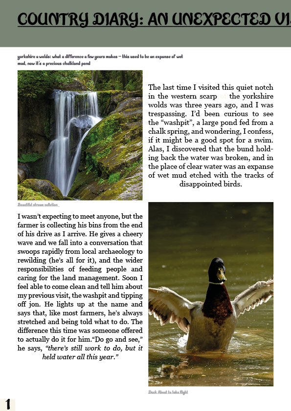
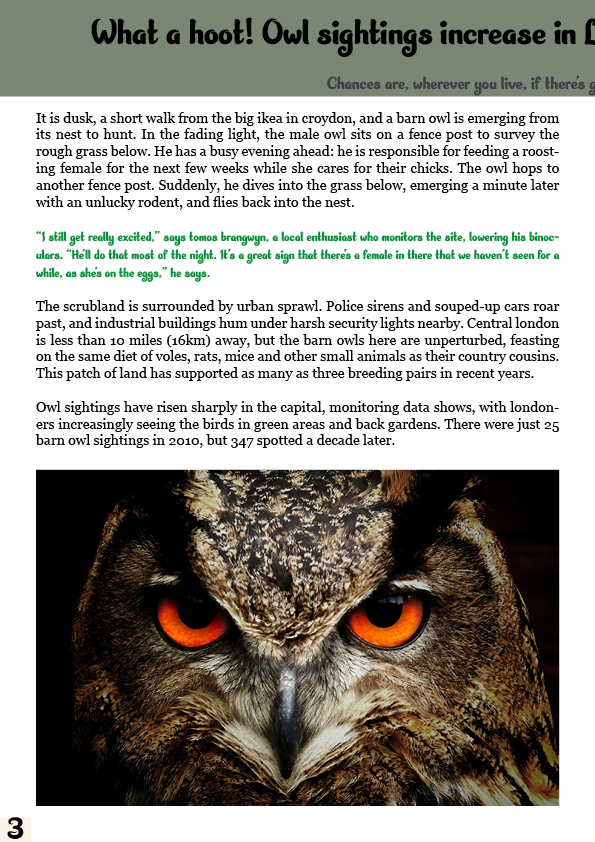
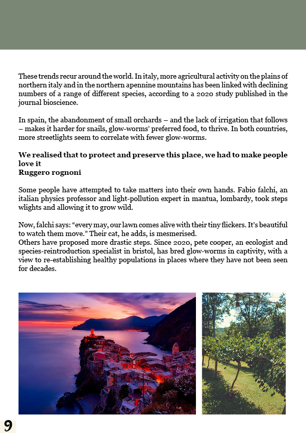
For this first article, I wanted to keep it simple. I chose to have a 4×4 grid that allowed me to have a simple and easy format to ease into the article with pictures related to the piece. I chose to split the story into three small blocks as I thought it would be best for the article as it makes it easy to digest and simple to read. I thought that the composition for this article was a good way to introduce it to the audience due to the lack of complexity and the minimal text needed to read.
Article Two
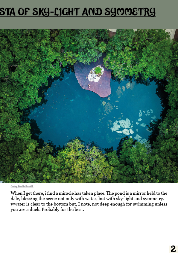
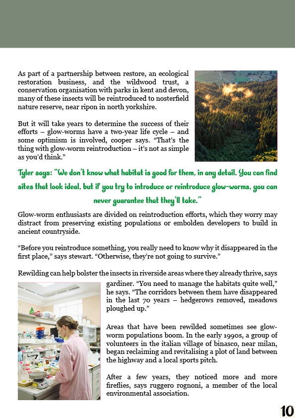
The first double-page spread for the second article I wanted to have a very heavy composition that is broken up by blocks of images, so I decided to have large blocks of text going across the full page without being broken up fully besides a pull quote. I did this intentionally to get the reader invested in the magazine. I had my first spread as a bait to get the reader reading, and then this page was meant to stick them with the bulk of the information, allowing them to get to know the story and get a feel for the magazine. I chose to have the pictures in quite a tight space as it allows the text to feel more impactful to the reader, not broken up every couple of lines by imagery.

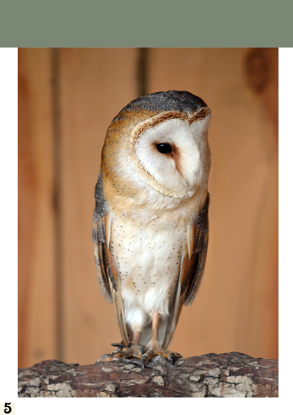
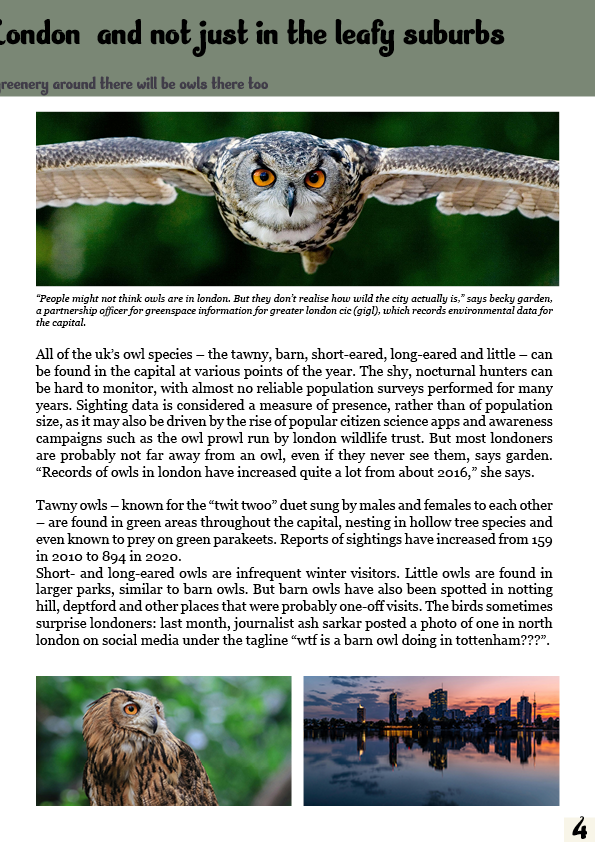
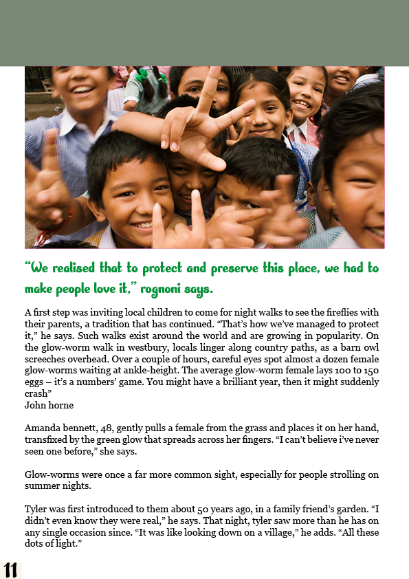
This spread was designed simply to give the viewer a break, a heavy photo-based composition with minimal wording and a pull quote to grab attention. The full page being taken by a photo was to fill negative space left over from the amount of text, but I also wanted the story aspects of the owls to be represented. The article specifically mentions barn owls, and I wanted this page to ensure that the mention was taken in and applied to the photo stage of designing the product.
Article Three
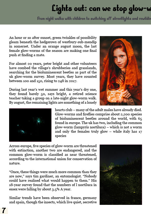

When making this double-page spread, I decided to have the page be very full of the different types of elements I have used in the previous pages. I have had the first page with the composition of a 4×4 grid, allowing me to have the photos and text be aligned instead of having blocks of one or the other. I think this allows the reading experience to be seamless and unbroken. You can see the picture briefly as you get to the end of each line, and by the time the last line is read, the picture can probably be admired in its full glory compared to the quick side glances while reading. For the second page, I wanted to have more of the similar style the rest of the magazine followed, but I decided to have the pull quote take up a bigger portion of the text, eye-catching as it takes the reader out of the big blocks of text, blowing them off to have a break.
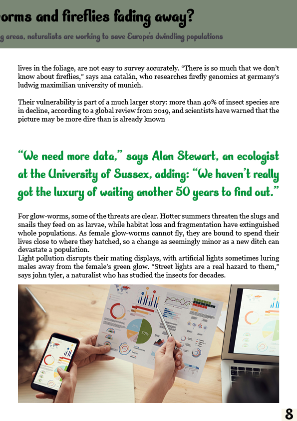
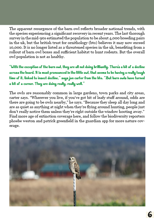
For these two pages, I decided I wanted to have the pages be very text-heavy as they are the final page before the end of the magazine. I thought it was a better idea to have the bulk of the information on this part of the double-page spread so I could split the entrance into the article and the ending. This page was the full information for the story. I chose this idea as I thought it mixed well into my work with the other two articles as it broke it up a little bit of the story and paced it nicely.

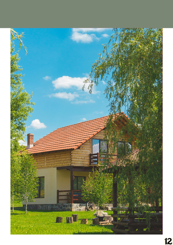
Finally, for this double-page spread, I wanted to have the page fill with relevant images as there was not very much text left at the point of making the spread, but I think that worked out for the idea I had with the spread. The imagery, while both different, allows to connect together and create a story giving connotations of nostalgia for playing in the garden as a kid, like the story describes .
Final Double Page Spreads