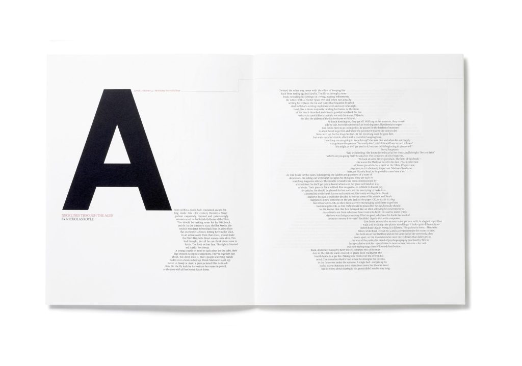
Composition
Good
For this piece, I think that the composition works well. I like the way the double-page spread decided to have a link between the pages, with the left side of the page having the rows of three with the title or photo, and the right side being on top and starting from the left just below. I think this works very well as it keeps a little bit of continuity linking the pages together. I think the choice to have this row composition makes the piece better as it’s used to swap the main theme of the page. The left side is used to have the text be the main part after the initial big illustration design, with the contrast for this to the next page where the design is the main part of the page, having the design and then the title of the issue and the date it is. I think this choice for the composition is a safe way that gives a visually pleasing contrast between the two pages while keeping along with the style the composition is set up to have. I think the composition of this piece has a balanced layout that manages to incorporate all the essential elements for the design while still having an equal balance between negative space and designs and type . I think that the composition of this piece could be improved a little by increasing the height on the right side of the page, having the illustrations line up with the big eye-catching design, as I think it would make a nice Z-shaped track to follow the page, and you could learn the information by finishing with the bottom right corner. In verbal, I think that the piece works very well, mixing a balance of negative space and well-thought-out placement following grid patterns and eye-catching design with an easy track for the eyes to follow.
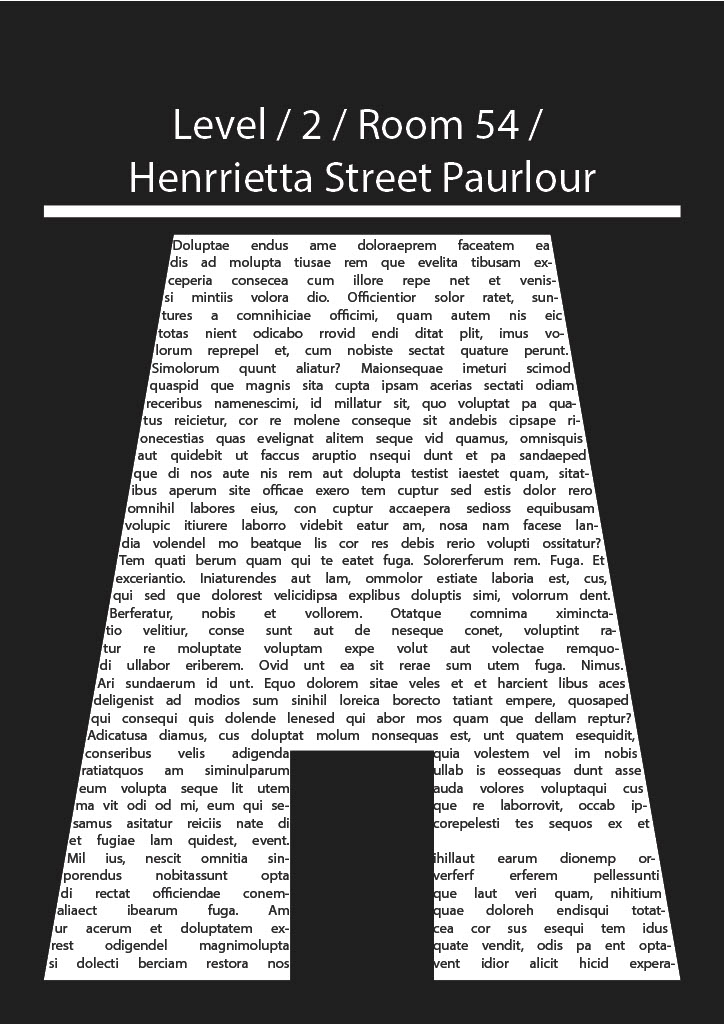
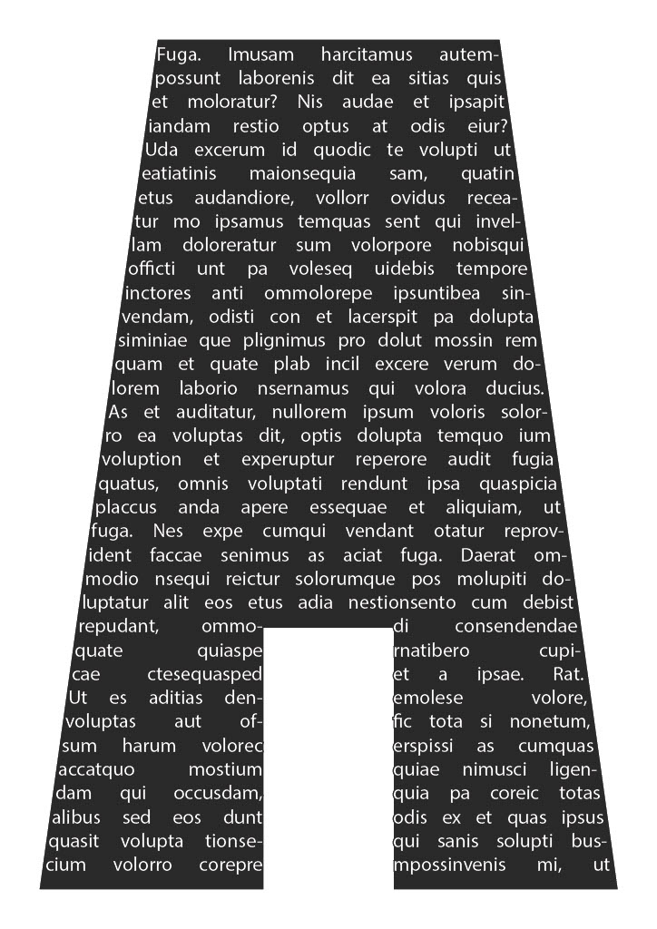
Bad
For this piece, I think that the composition is weak due to the lack of structure. The piece is designed to have a composition that is based on the text within, but I think that the final outcome lacks the structure necessary for an easy read. The problem with this is that the legibility is a big problem with the left-to-right free-flowing design. The track for the eye to follow gets obscured after the big, bold A on the left page. I think this, combined with the negative space taking too much of the page, means that the negative space becomes an issue as it is not used in a way that is experimental and intentional. It feels like the design is trying to fill the space and has not succeeded as there is no obvious flow or pattern to the piece. Another fault with this spread is that there is no obvious connection to the content. I think for the design to be improved, the negative space needs to be dealt with in another way. I think that for experimentation, the use of the sloped text boxes could be kept, but I think the composition needs to be changed around and added to. I think another flaw with the spread is the legibility in terms of the font size. I think the font size is too small, this combined with the obscured track makes the piece extremely hard to read and understand. Finally I think that the piece does not reach out to the audience in the way it was intended to
Redesign