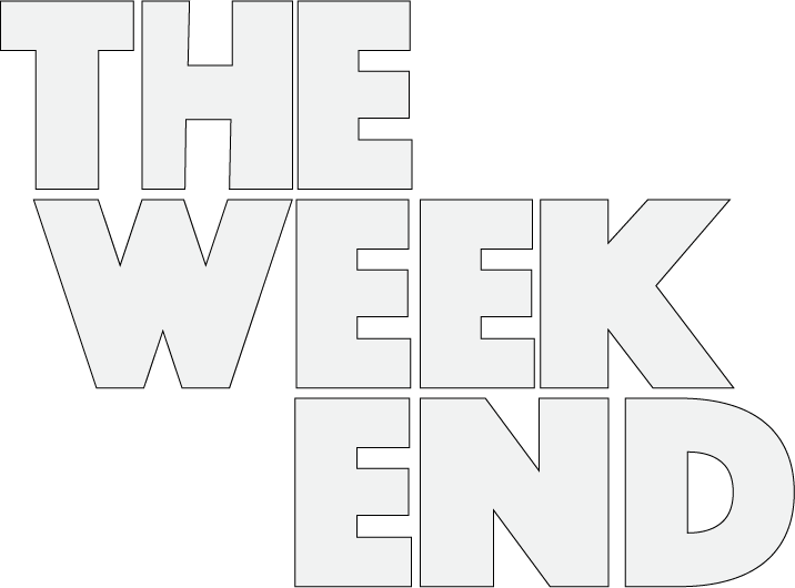
Online Conceptual Editorial Masthead (Logo) Design

for my editorial mast head I wanted to have the logo I had created be inspired by a form of nature in a way and when thinking for ideas I had the idea of having the ” the weekend ” title be in the typeface for the titles in my magazine.
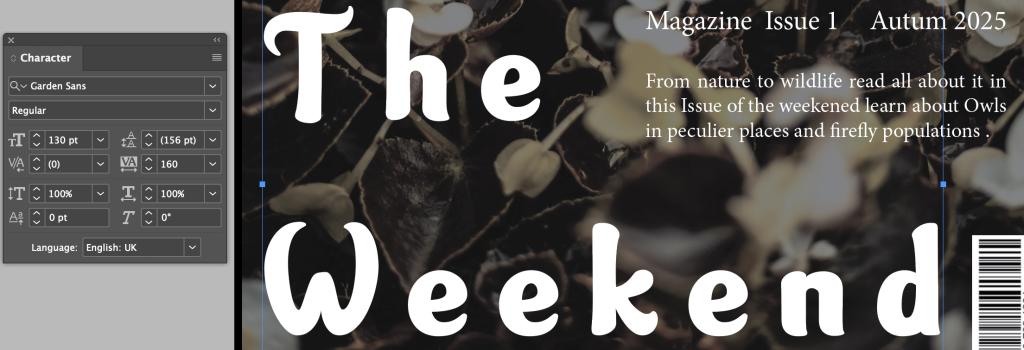
After having this idea I decided I wanted a logo that could be shared across all three of my covers. When looking for inspiration I wanted to have something that I could even partially link to nature so my idea was to have a design based of gardens in the way that they are uniform and carefully planned out the plants are place in the way the gardener wants and are aligned nicely.


The idea I wanted to follow with the gardens having an organized Layout I implemented this in to my logo design with the organization of the letters I aligned each f the letters to each other giving them a nice thoughtful connection of all the letter inspired by the idea of gardening and the neatness of the hobby.
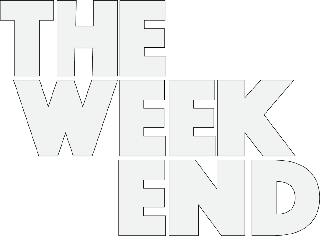
I decided to have the white logo be the main logo for my cover spreads as I thought it would stand out the most on the light backgrounds I was applying it to on the front covers as I thought the black while it would be visible I think that it would have been less visible and not as pleasant either way so I decided to have the white version of the logo be the main after testing the black and against the colours I was using in my cover designs.
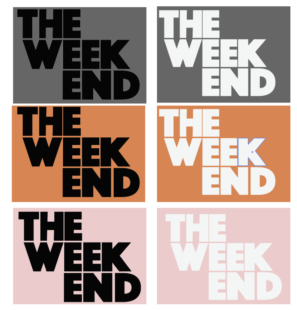
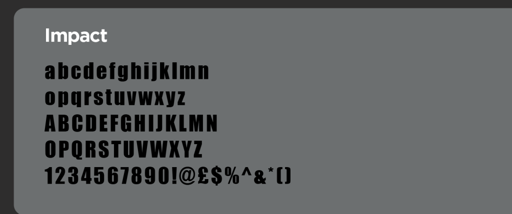
The Font I used to create the logo was the impact typeface as I thought after testing some Fonts that it would fit best for what I wanted to do based on my ideas and experimentation I decided impact is the best way to execute the logo design I wanted to achieve, as it was minimalist bold and legible while standing out even in heavy compositions


Finally I decided to split the word “weekend” into the words “week” and “end” because I thought it would give a nice track for the eyes to follow also it would allow the logo to stop from being too stretched out and finally
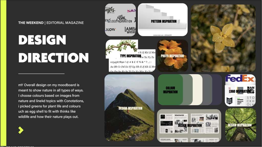
For my Overall plan for my logo I had the idea of linking it in with the nature theme of the magazine but I ultimately decided to have the finally thing relate in a less obvious way my logo is bold minimalist and adaptive, this reflects the theme in more ways then one as Nature manages to portray those traits constantly with bold colours and shapes that managed to create appealing structures it also is able to adapt and to its surroundings to survive I wanted my logo to portray this with its bold Typing and its minimalist nature making it able to adapt and fit into many different environments of Magazines and cover designs.
Final Logo
