For My Final designs I wanted to have pages that fit well together in colour scheme and all felt like they were meant to be there and they were needed I tried to do this by having them functional and ready for the way the customer would be using them.
Home Page
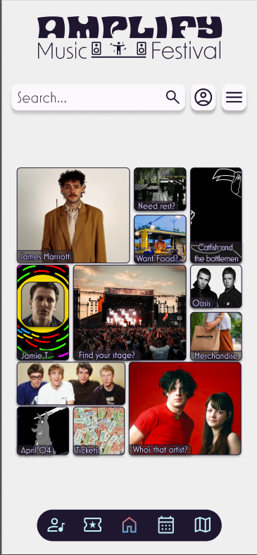
For my home page, the page is laid out in a bento box style, hovering over the different boxes in the bento gives them a hover state where the box darkens and the text moves to the center. The page also features a search bar that takes you to the page related to your search. The artist results also have their own unique pages listing some of their albums and songs . The page features a hamburger menu and a profile button, which with further development would open to a settings page and a profile page.
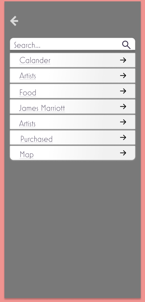
Tickest page
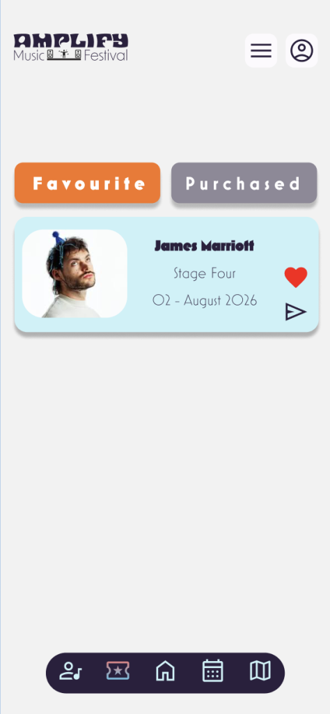
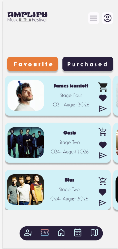
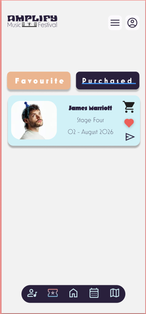
When making this page, I wanted to include a couple of features, including filtration and a way to like and see which tickets have been purchased. This led me to make different pages for the section so a person could keep their flow while having something to come back to on the page. I wanted the pastel light colour scheme to be visible but not too harsh on this page, so I settled on the minimal colour changes.
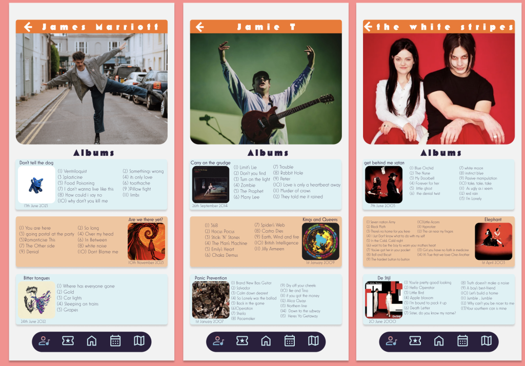
Artist Page
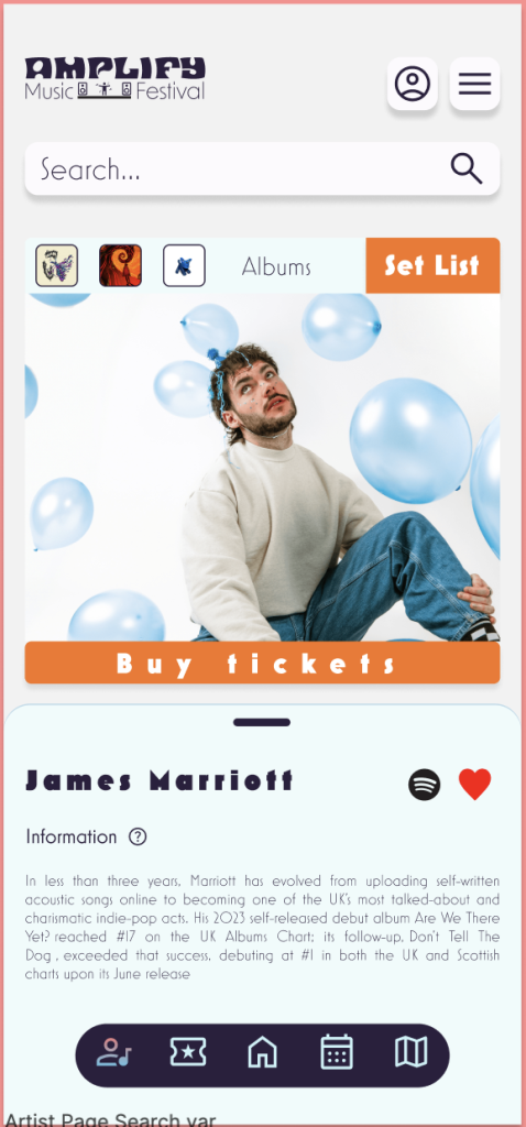
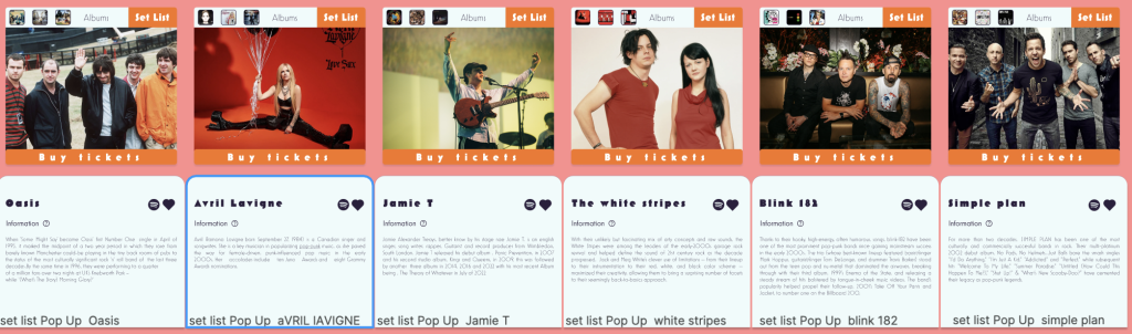
This artist page is made for the user to explore through the different artists the main page opens on. James Marriott’s ticket, and then you have the option to slide left to right to see each artist. All the separate tickets include a section with a made-up set list for the performance as well as a like button and a Spotify link going to the main page. Then the albums, when clicked on, take you to the link for that album on Spotify. All pages include a little information about the artist.
Calander
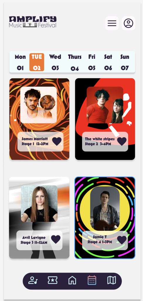
For my calendar, I wanted the page to have some unique features for the artist demonstration, so I drew custom tickets for each of the artists based on some of their most notable albums. I think this gave the calendar a nice and fun feeling, separating it from the rest of the app in a fun way. The calendar has a heart system with the idea being that a system page would be kept with a list of the people’s favorites to go see them. The page also has a calendar week bar with the intention being that they would be able to go through the different days to see who was playing.
Map
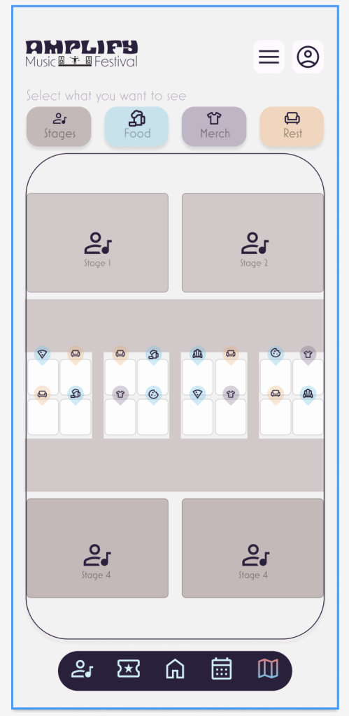
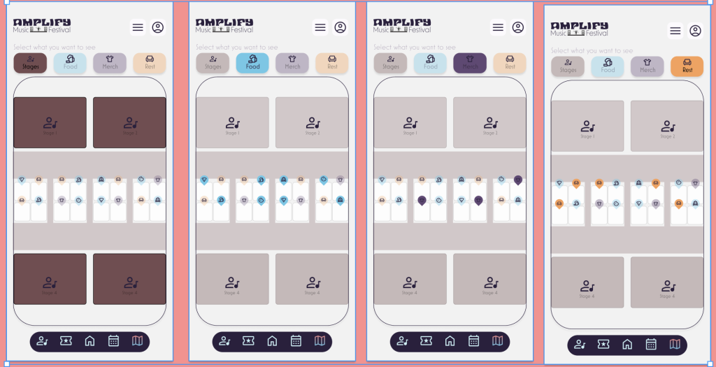
Finally, my map was made to be simple. It has four filters for the person to find exactly what they want from the stages to the rest spots. I thought about having a pinch and zoom system but decided against it as the colour co-ordinated filter system worked better for such a small area in my opinion, allowing the person to see exactly what they wanted without having to have a cluttered map.