Colour
Good
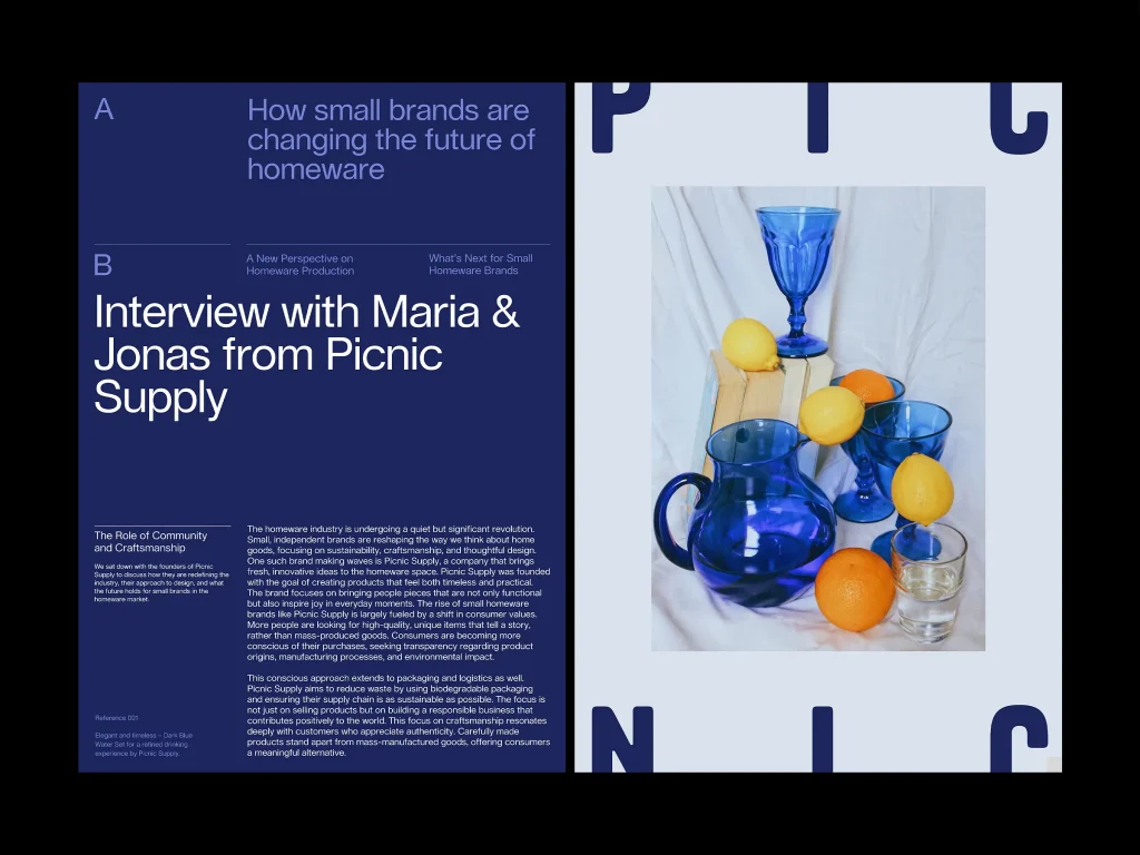
For this piece, I think that the example is a great example of the use of colour because the piece uses a simple palette that manages to have contrast and bring warmth through cold colours, making the eye catch throughout other pieces. The blue palette that the spread uses makes the piece a great example of colour. I think this is due to the choice in shades of blue; the darker blue for the background allows for the use of the lighter, more visible colour for the text to be fully readable and not clash. Furthermore, I think the use of the least saturated, bigger text in the middle of the first page is a great way to cut up the page into different sections. Having this big piece that is not only eye-catching but using colour as a tool to separate the piece makes a good and interesting way to have colour used as a tool. When looking at the piece, the blues used give a calm feeling reading throughout the entire piece, even through to bringing the warm colour with the photograph, having the warm orange and yellow giving the view a connotation of sunset. The piece’s colours construct an image that’s relaxing and soothing, like a seaside with the warm sun and sandy colours from the book making the reader feel like they are on a beach, relaxing. The use of this imagery is further fortified upon reading the piece with the company name being Picnic. The company’s activity shared name being something that happens regularly allows the colours’ construction of this image to be impeded in the reader’s mind. The use of the darkest and lightest colour for the right-side page to contrast allows the piece to have negative space in-between the type that does not feel empty or forced, as the colours both being cool shades of blue links them and feels intentional for the colour to fill the piece, making the use for this page work in my opinion.
Bad
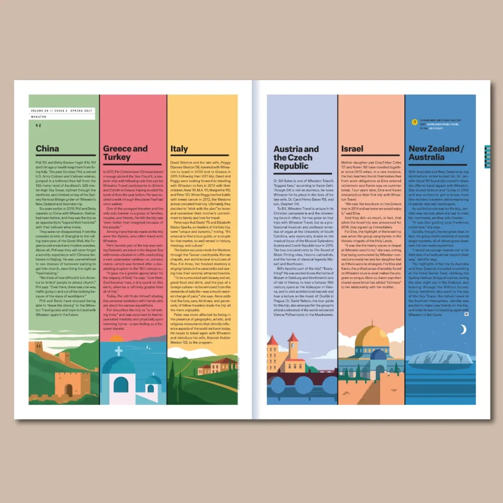
For this piece, I think it doesn’t work due to the colour not being the right choice to have the page be very readable. I think the choices of colour, while visually appealing, were more thought out for the designs in each of the columns, whereas the actual type for the piece was not thought out very well, and due to this, the colour becomes the problem of the piece. Having them match with the designs, being the sky for the places, would work. If the skies were less saturated, so the text could be read more easily. I think the association of the colours could be changed around swell, as I feel like things like the choice of China being green when red could have fit better due to the association of luck in Chinese culture. I feel like the change would positively impact the piece, giving it a more positive and pleasing final design, adding a little to incorporate aspects of the countries’ cultures and associations. Another thing I would change is the composition of the countries’ colours. Instead of having the colours feel randomly placed, I would have a gradient layout going from the warm reads and transitioning to the orange and yellow from left to right, then into the cold blues, and finally finishing with the green, giving a more visually pleasing composition for the colour as the pieces connect more together and make the piece more eye-catching. Where I do think the colour works is the decision to have the soft pastel colours that are nice and fit the style of the piece easily. I think for the final updates to the colour I would make is maybe following my idea for the soft gradient I would switch out the green colour for a purple and have that be the final colour opposite to the red as it would give a nice full circle feeling having the piece be fully connected from both sides.
Redesign