Three Cover Designs
Cover One
First Version
Final version
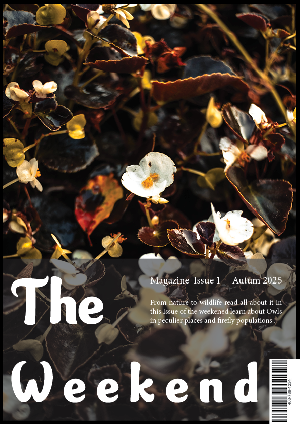
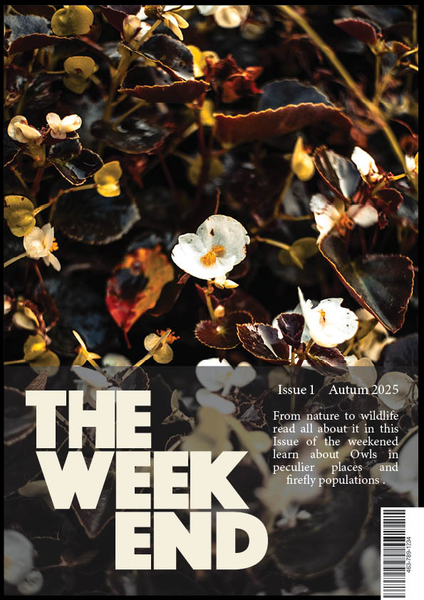
For this design I wanted something that would not directly relate to any of the specific articles in one way more then he other so I chose to have a photo that relates to nature as that is the overall theme of the magazine . The photo is a photo I took of a flower, I wanted to have this photo as it is relating to the nature theme and it uses colours that are not always associated strongly with nature with Off whites and darker browns I wanted this to give a more autum winter feeling to fit with the Autumn text release for the magazine. For my typography I wanted to have a title be simple and link to the text the rest of the covers so I decided to have the logo I made for the magazine as a Sans serif font impact with the letters aligned to give a nice uniform style that fits within the set of titles. I changed this from the first version because I wanted yo have a connecting feature between the three designs. I originally for my typography I wanted to have the title font Garden sans because it would link the titles to covers on the outside.
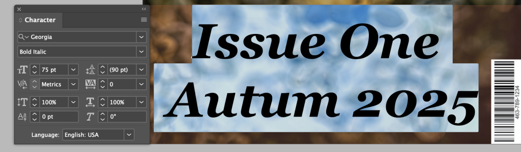
Cover Two
First Version
Final version

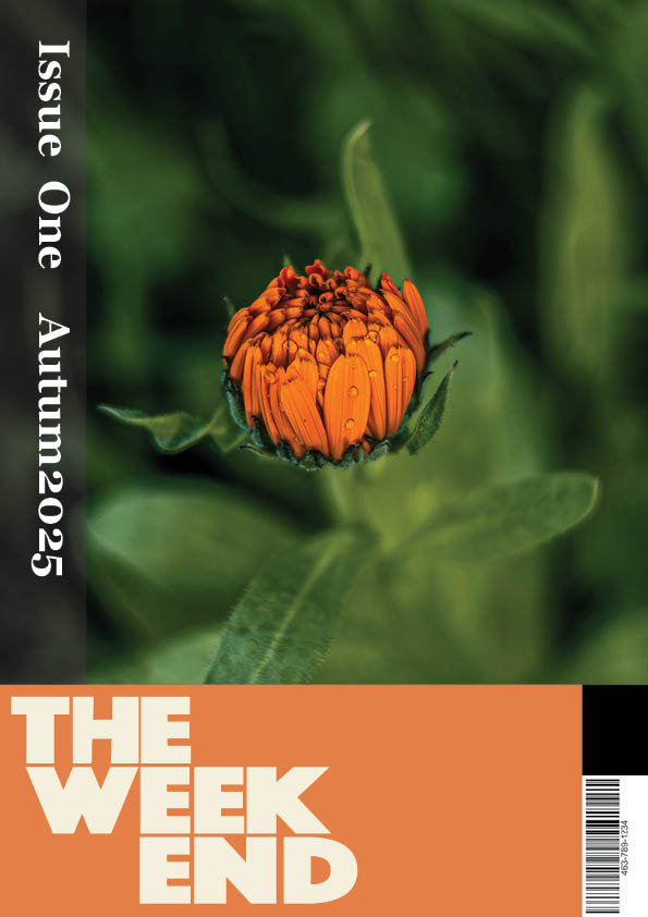
When creating this piece I wanted to experiment with a few things first off I wanted to have the text for the issue and the release date going down the page on a 90 degree angle that is because I didn’t want the entire piece to be with horizontal text I thought that have the L track to follow for the text was a nice touch to change up from other covers i have created. I Chose a gradient for the block background of the title as I wanted to have a gradient made from Colours within the photo. The photo is a photo I took but I chose to have it to fit the nature theme the three articles follow. Finally for the changes to the final design I decided to have the color be solid picked from the flower to link the two and make the cover more uniform and appealing to the eye keeping a minimalist style. Final step adding the minimalist logo to connect to the other covers.
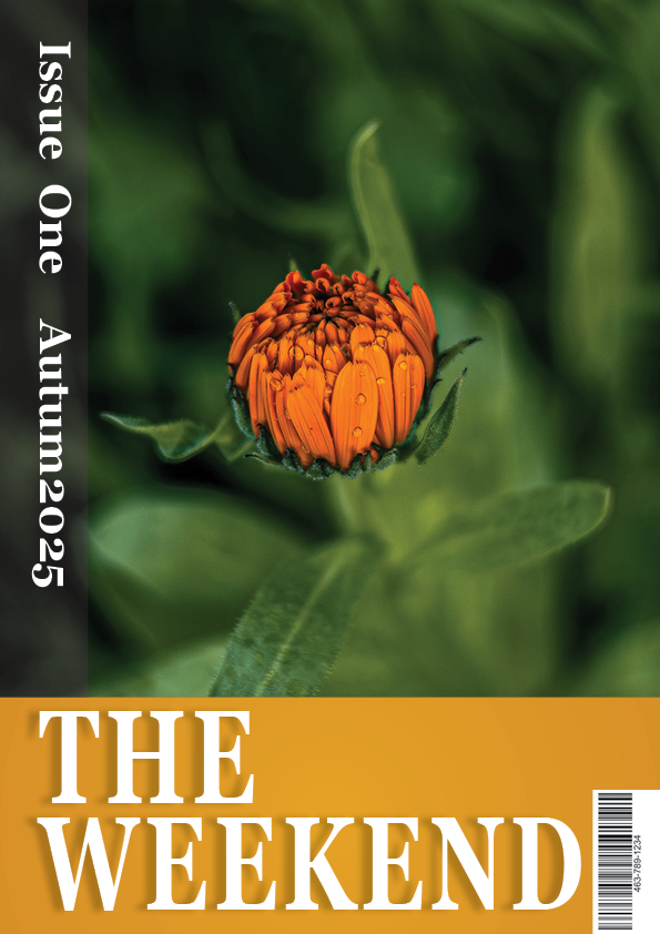
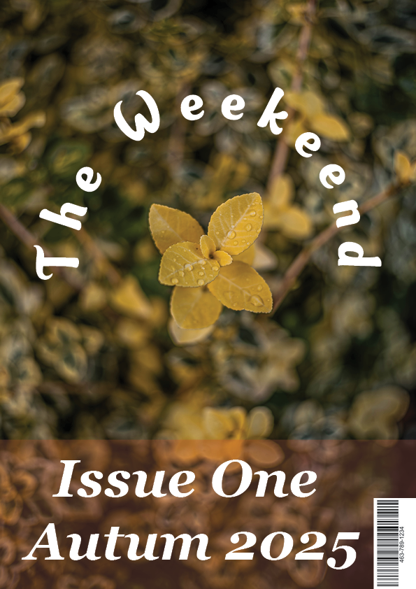
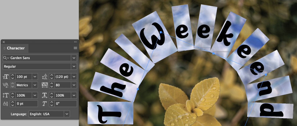
Cover Three
First Version
Final version
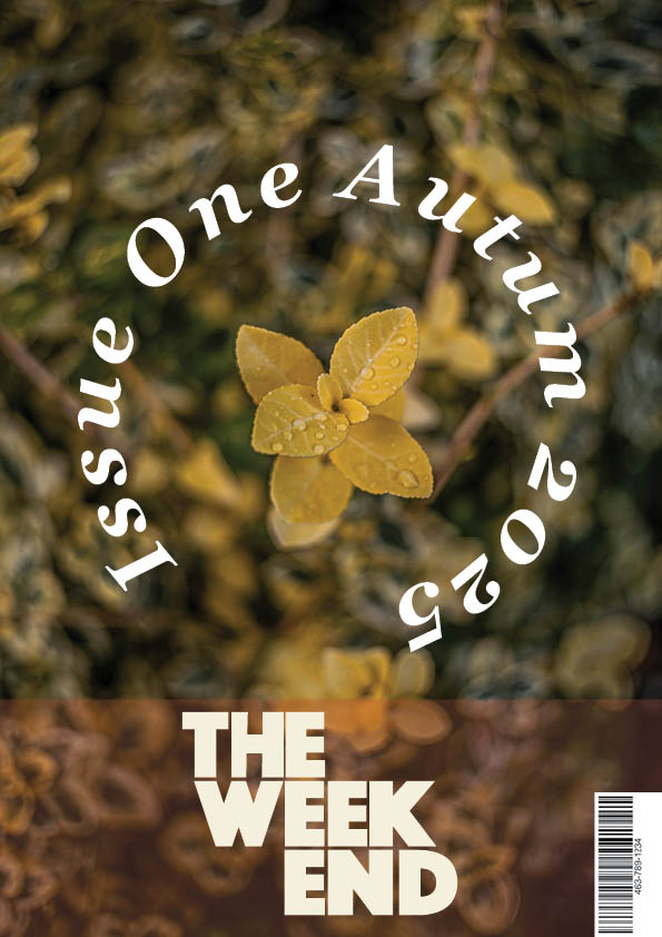
Finally when making this Cover I chose to have a simple design with the Logo curving around the center piece of the photo being the flower, I wanted to do this because it starts having the eye be attracted to the center. The words in the center I wanted to experiment with changing the tracking to make it spread round more of the curve and I then I had the Issue and realase date be in the center in the Georgia font to have it match with the rest of the article text. After doing this to make the first version of the cover I had decided to have the run through logo for the covers so I changed around the composition of the features having the logo take the place of the Issue number and the date. I think this works better as the curve affect takes more room making the full circle effect of nature feel incorporated in the design.
Final Cover Designs