Typography
Good
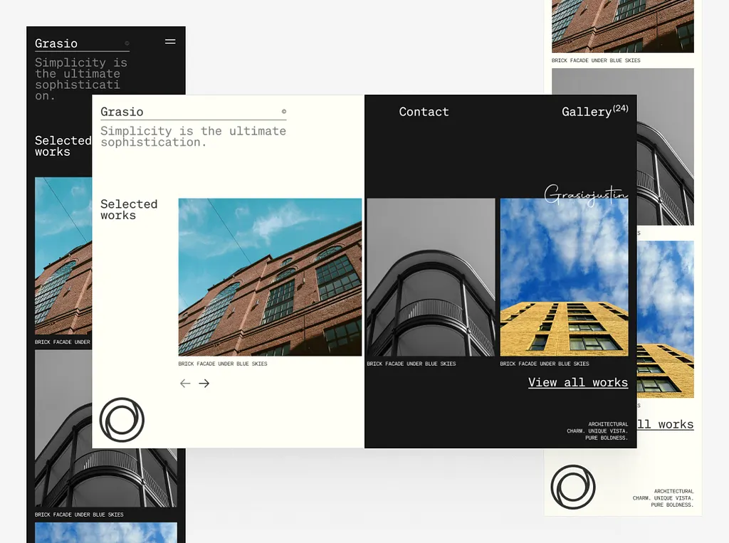
For this design, I love the way the typography has been set out. The design uses a soft serif font that fits the piece perfectly. The typography is simple, and I think that’s what makes it work for the double-page spread. The whole typeface, from the bold underlined titles to the small unbold moments under the photos, shows the reader that the entire point is simplicity in a minimalistic style. The line ” Simplicity is the Ultimate Sophistication.” In my opinion, shows how the typography of this spread is used and how well it is displayed. I think that the use of the raw type being unbold and not italic conveys the point in a strong way that is simple and manages to do as it tells, being sophisticated. Placing the text in the left corners of the elements it is attached to creates a nice track for the eye of the reader to follow, having a diagonal line that starts in the top left with the “Grasio” text and finishing with the “Pure boldness”. I also like how the piece does not just stick to the one type of placement on the right-hand side of the page; the designer decided to have a bit of type overlap with the photo. I think that this decision to have this in the design adds a nice message for the overall point of the image, in that experimentation does not have to be over the top and some big show of words. I think that this message works with the typography and the goal of the design having simple experiments that make the entire piece more detailed and cared for.
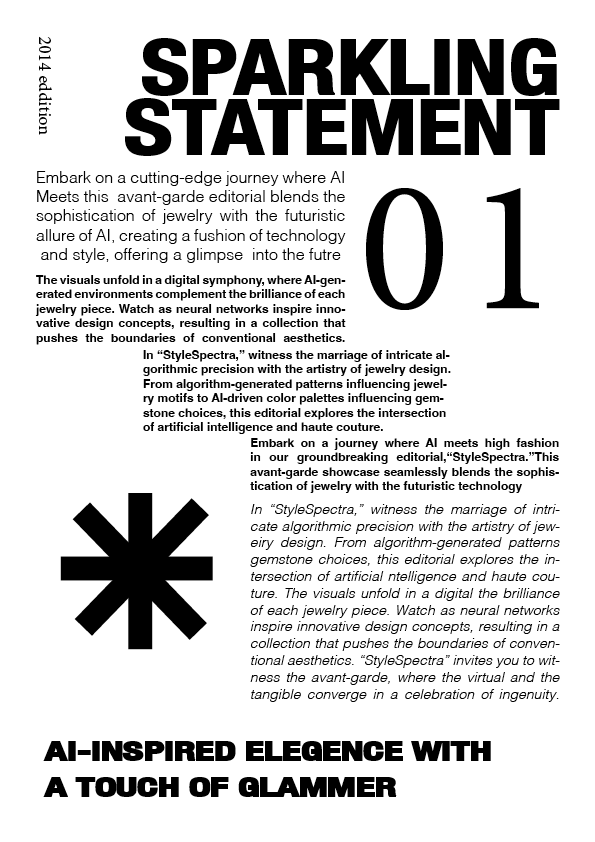
Bad
What I don’t like about this design is the way the double page spread attempts to experiment with typography in my opinion doesn’t work. The first eye contact with the Page works I think with the bold fat sans serif font contrasting with the Thin bold serif font, I think that this works but then the right side of the page is attempting different experimentation with loads of different elements and I think that they do not work together. I think this because the page has too much going on in terms of style changing, the changes of font size does not allow for the viewers eyes to adjust and makes the experience reading the paper frustrating and confusing. I think to improve this piece I would make the font more uniform and have the sizing change more proportionally I think that this change would make the text less confusing to read I would also change the position of the text as the heavy lean to right does work in my opinion, I think that if the heavy lean is wanted the texts needs to be cut of from the titles on the top and the bottom to separate them a little. The overall design in my onion does not work as a double page spread as they do not feel connected even though they are meant to be the same thing.
Redesign