Typographical standards
Fonts
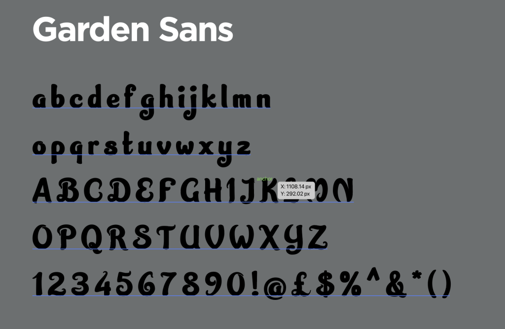
Garden Sans
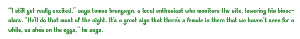
For the titles in my magazine I wanted to have a font that made the nature theme of the articles be felt and recognized in the titles so I chose the serif font Garden sans I chose this for the titles because I felt that it was the best choice it is a fancy seeming font that fits while standing out from the rest of the article making the titles obvious and appropriate for their purpose I think that this font was a good choice fro my titles due to its unique look. I paired this look with a sentence case that is underlined and bold. as well as the titles the garden sans font is applied to the pull quotes because I thought it would have the same effect as the titles these quotes are in green as it fits the color scheme of the magazine finally the green is a more color blind friendly colour ensuring that ht magazine is more accessible to all kinds of people.

Georgia
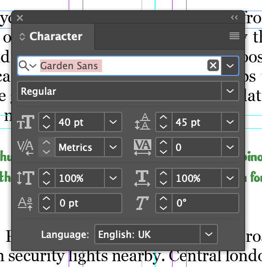
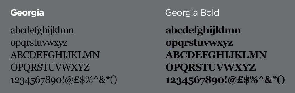
For the main font for my magazine I decided to have the font be the serif font Georgia as this font was simple and easy to read when pared with the hyphenate turned off on indesign the font works well for the article it allows the reader to be able to read the piece without any unique or off putting sight. When using this font for the titles in the article I decided to have a font size of 40 for all title this allows all titles to have the same format and recognizable throughout the magazine all titles share the same settings. The decision to change to this font was made from suggestions from My lecturer Justin as he was helping me with my work and suggested having a font that was more readable and was easier on the eyes as my first concept had the garden sans font be the main typeface for the entire magazine being all the information.
Experimentation
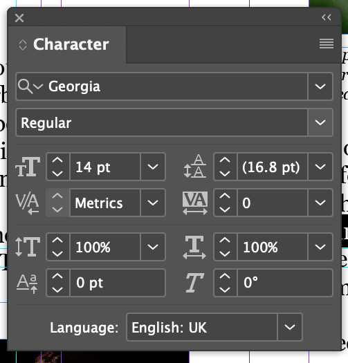
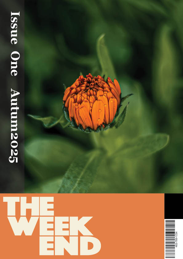
For my typography I wanted to experiment in some sections to have a interesting use of my typefaces and fonts I decided the cover designs was the best place to do this as it was easier and gives me a more broad canvas to try new things with. I decided to do this on my Second cover by experimenting with the angles of my typography having the release date and the issue number going down the left hand side of the page being on a 90 degree angle i chose to have this here as I had experimented with the idea of it going across the top of the page but wanted to change the composition of the piece up and have an interesting typographical feature that is unique to this cover design. following with the idea of adjusting the composition to experiment with typographical features in my work I decided to have the final cover page have the same features bend around a center image to draw focus to both the image and the typography in the text. Doing this I had the words curve around a circle that is centered on the flower in the photo this allowed me to have the two elements be present and leave plenty of negative space to admire the unique blur of the photography in the cover around the focus point.
Hierarchy
For my Type hierarchy had this setup having all my type orders and planned to how type was going to be written in my work this screenshot is a detailed section of how I planned my Typography Hierarchy for my work on the double page spreads.