Conceptual Design
Good
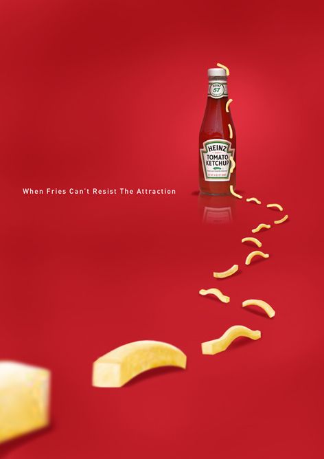
For this design I think it works because the idea represents what is meant to be done for conceptual design it takes a simple idea and expands on it to allow you the view and to explore the design and figure out what it means this Ad in particular is an ad for ketchup and uses a full red background to make the ketchup bottle blend in with poster this takes the attention away from the bottle and makes the attraction point the fries that are crawling towards the bottle using the idea of ants, Ants following in a trail to get what they want as a collective the fry representing the ants give the viewer the idea that the fries need to be with ketchup they want to go together. This type of conceptual design works because of the bold simple colour that catches the eye and lets the complementing yellow be the main thing that makes this piece work is the simple line paired with the ad ” When fries can’t resistive attraction ” This text while simple like the rest of the design finalises the idea in the viewers mind that the ketchup is irresistible this idea is built with all the features combined making the ad an affect way to spread the idea that Heinz ketchup is the right choice of ketchup and should be the one thing they buy to go with there fries . I think maybe for slight improvements the add could maybe have a photographic element for the chips making them more realistic and appealing to the viewer.
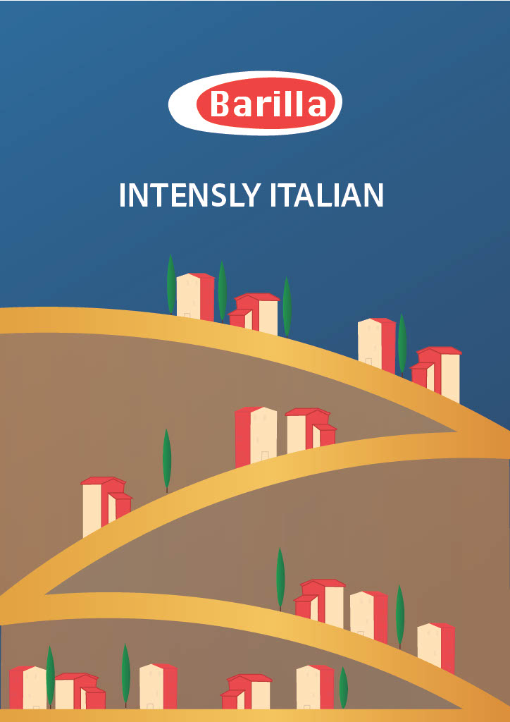
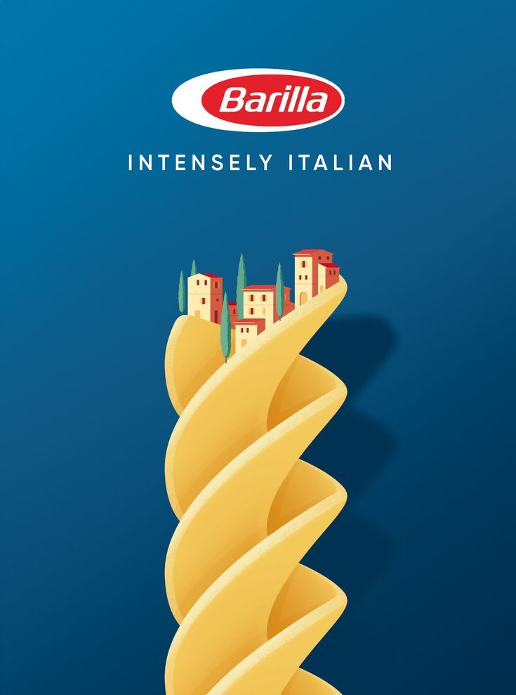
Bad
For this design It is part of a series of conceptual designs, I think this one in particular does not work as the entire point of the series is having the pasta shapes incorporated into a design with the message ” Intensely Italian ” I think it does not work for this design specifically because the idea for the design does not fit the message I think the Italian architecture is lost on the pasta shape. I think the idea is not as clear of as the others in the series I think to fix this the idea can be kept fairly similar I think the main problem is the pasta shape. I think having the fusel Pasta shape does not work for the idea they were trying to complete. I think to fix this I would use a spaghetti noodle and have it in. the shape of a mountains and then have the Italian archetecture buildings along the mountains noodles. These design changes I think would compliment the idea and the series and make the ad fit more within the idea it is trying to present. I think maybe as well as changing the pasta shape I will try experiment with the colour of the piece to give it some colour that fits the theme of Italy maybe changing the building to the colours of the flag and or having there shadows be the colours.
Redesign