Logo
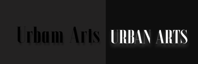
For My logos I wanted to have two logos for contrasting backgrounds as well as one I can use to show off for the fancier and more eye-catching parts of the app The first logo is simple and Formal in the sans font Ala, I chose this font as it is legible simple and stylish fitting for the museum logo. The secondary image I chose as a contrast for dark backgrounds like the place of the opening parallax scroll its flashy shows on dark backgrounds easy to read and the glow makes it eye catching giving at a visually appealing look to the viewers I think they fit well to work together in the places they are used throughout the work.
Hierarchy of type faces
For my hierarchy of type faces I did not want to complicate the app too much so I used two typefaces in my work throughout the Ala font used in the logo serves as the main font throughput the app being the main vessel for information and titles the pages follow a different font size for content based on the page display for example the tickets page follows a 18 for the titles and 8 for the information text allowing them to be separate while keeping a fairly consistent sizing throughout with the font differences between title to text being no more then 12 aside from space filling title that are designed to show the event.
Colour Palette
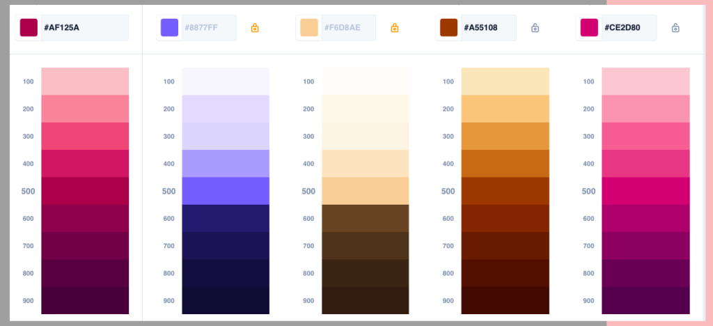
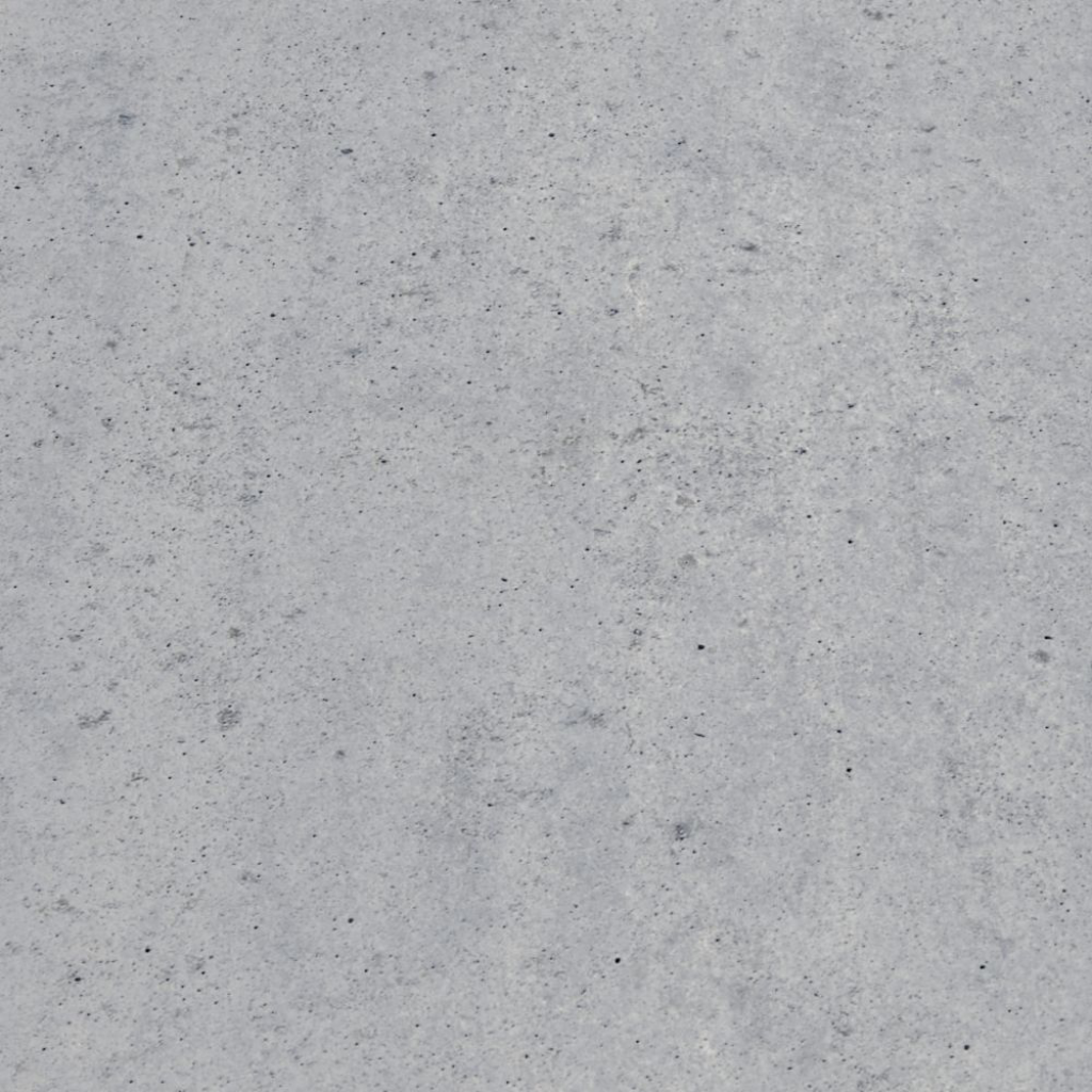
For my colour palette I wanted to have something that stood out from the design of my museum and that style so I chose a bold pink and purple theme as this would contrast nicely with the minimalist modern style of the gallery but would also work for the app design the background of the app has the textured concrete grey of the gallery as its background so using the pink and purple throughout aloud be to separate the elements from the background making the app feel more lively and fun.
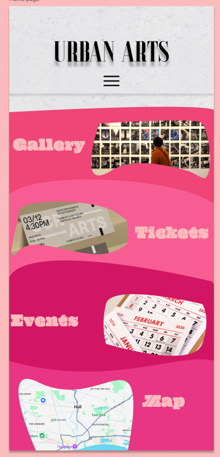
The purples and the oranges stand to fit the buttons allowing them to be visible but fit well together to not be the entire focus point of the page they also fit in with the editing of my photos I have sued for the app usually having a warm vibrant edit.
Decorative graphical elements
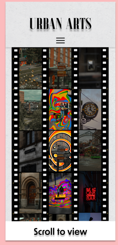
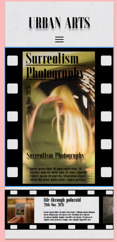
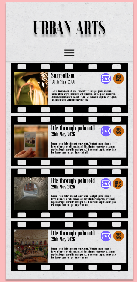
For decorative graphical elements I wanted to have a running graphic throughout my app for relevant pages to bring a lot of it together for this io decided that I was going to have a film strip as the project is entirely photography based for the museum medium I thought that a film strip would server well especially for some of the features I added like having the scrolling reels of photos and the information for the events being scrollable I think this added a unique fitting feature to the project and allowed for relevant consistency through pages within the theme of my app and medium.
Button and UI patterns
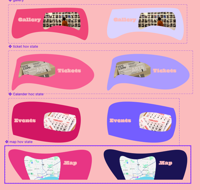
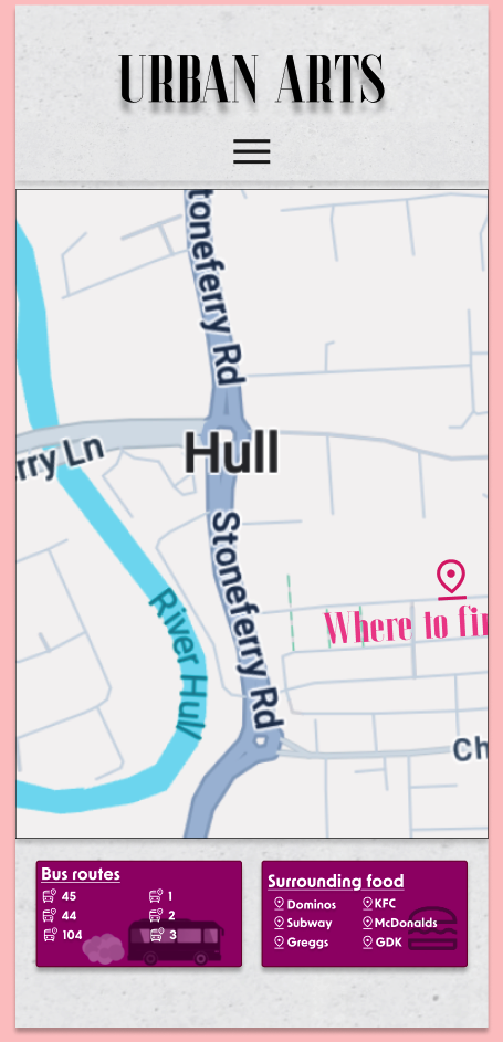
For my buttons I wanted to use my colour scheme well for the opening landing page I choose to gave the fun pink buttons with obscure shapes that change to purple when hovered over, I did this because I wanted the app to be established as a separate entity to the app it is still a companion app that is shown through the concrete design and formal layout but the flashy colour and vibrant buttons lets it be separate and fun to use making it feel easier to use.
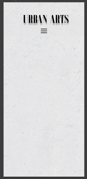
For my patterns I used this template I created with a concrete texture background and the menu being 16 pixels under the logo I wanted this as it gave me a base and free will to greta my other pages while keeping consistency this allows the users to explore the pages instead of having to relearn every button for each page and the new menu placements a single placement allows for a better flow and exploration of the app and overall usability.