Landing page
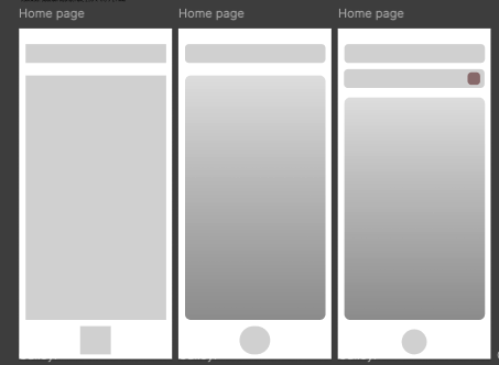
For my low fidelity home page iu wanted there to be a clear layout for how my app was gonna look I started by having a very similar Layout with the title and the big space for the content but originally my low fidelity prototypes had the idea of the main navigation being at the bottom of the page it did include the final menu placement though as it evolved originally being a title placement at first idea.
Gallery
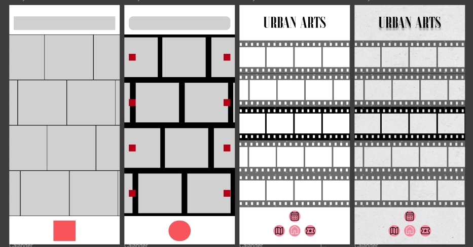
For my gallery the low fidelity had the idea of the reels being implemented from the very start as I wanted the photography themed design element to be present for consistentcy throughout the page but the gallery was how the idea originally started, I had the first pieces be horizontal as I had the idea for them to be low opacity aside form the one you were scrolling on but I changed the design later to be vertical as I shoot in portrait a majority of the time. The gallery also has the first concept for the original navigation plan being the button that once held change into the navigation icon.
Events
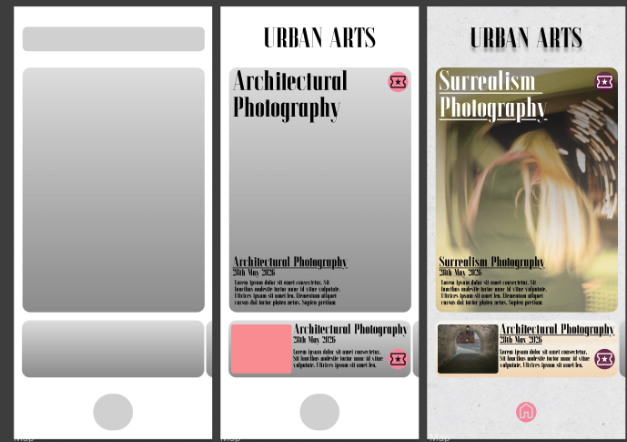
For My events page I started with the base of the landing page as I wanted it to have a similar layout originally. The design then led into the main/current event being the big piece to show off and get people interested in the place and then they could scroll through the other events at the bottom.
Map
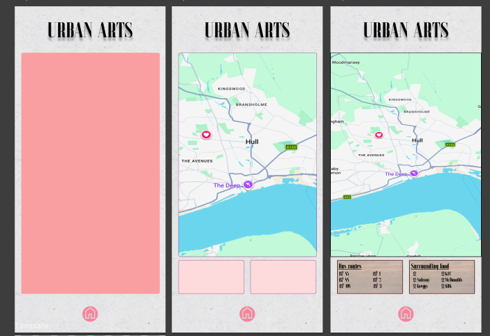
When making my map I just thought of having the map and you would scroll through it to find the museum but then when looking at things like accessibility and the overall vibe of the museum I thought it would be useful to have information of the food and bus routes around the museum allowing users to find food and the easiest way to get to travel to them.