Art gallery website and app designs
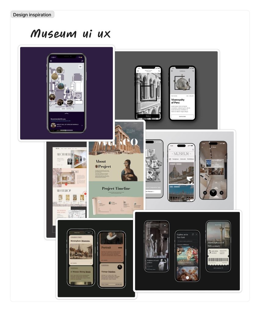
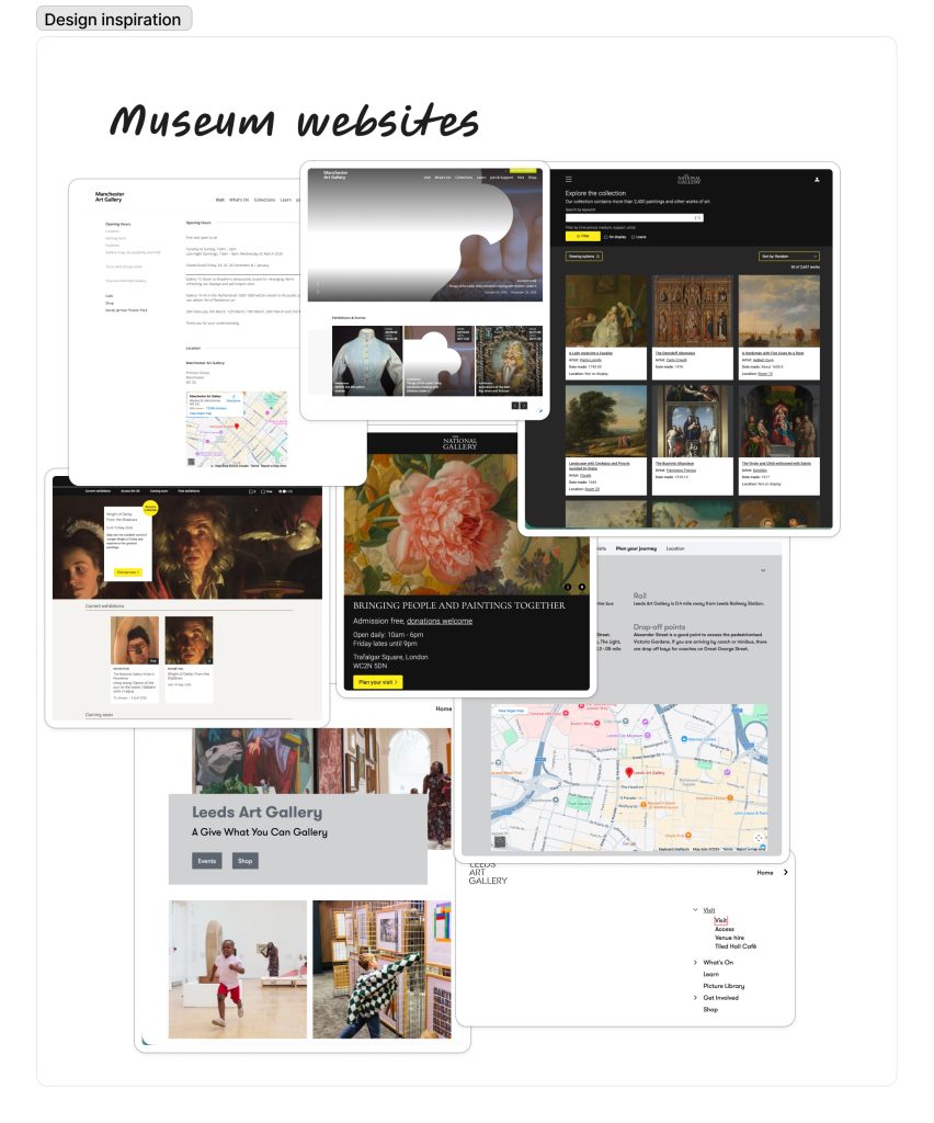
For my research, I wanted to look at art galleries with a minimal style. I wanted this style as it fits the modern look and layout of the museum I want to have the exhibits be at. I want this style with apps with the muted colours and simple layouts as I think it allows the design to be about the exhibit, allowing the artwork to be more important. This style will also allow for the app to be more functional and easy to understand. Having the idea of an easy-to-follow app can put more exposure on the exhibit, like the Leeds Art Gallery website is plain white and has a straightforward approach to each page but still shows off the main point, being the exhibits, and shows families and people why they would want to attend.
Secondary feedback relating to user experience from other art galleries
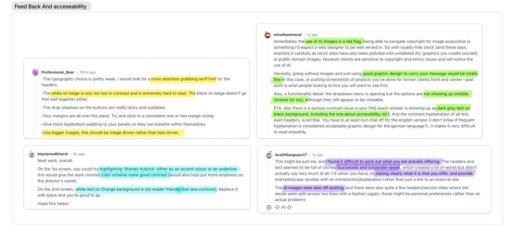
When looking at the feedback other websites for museums have had I came across 5 main concerns
- AI image use
- Contrast for ledibility
- cause / point
- design choices like picture use
Ai image use is a factor that I do not want t apply to any area of my project, I will not be using Ai imagery in my work like the piece comments suggested I will be using royalty free imagery , my own primary Photography or illustrative work I have created for the project. For the problems with contrast I will conduct sample pieces for colour schemes that will tell me whether or not my work Is legible and the colours are correctly chosen to be accessible for readers with issues like colour blindness. I Intend to have all my work be understandable and obvious with the intention through use of layout and hierarchy as well as using the typography to help make the pages uniform and understandable. Finally for criticism on websites with the picture choice and scaling I am using Images that follow a strict aspect ratio having my images following this aspect ratio will allow me to scale correctly and will give my app a clean and uniform look ensuring for a pleasant user experience.
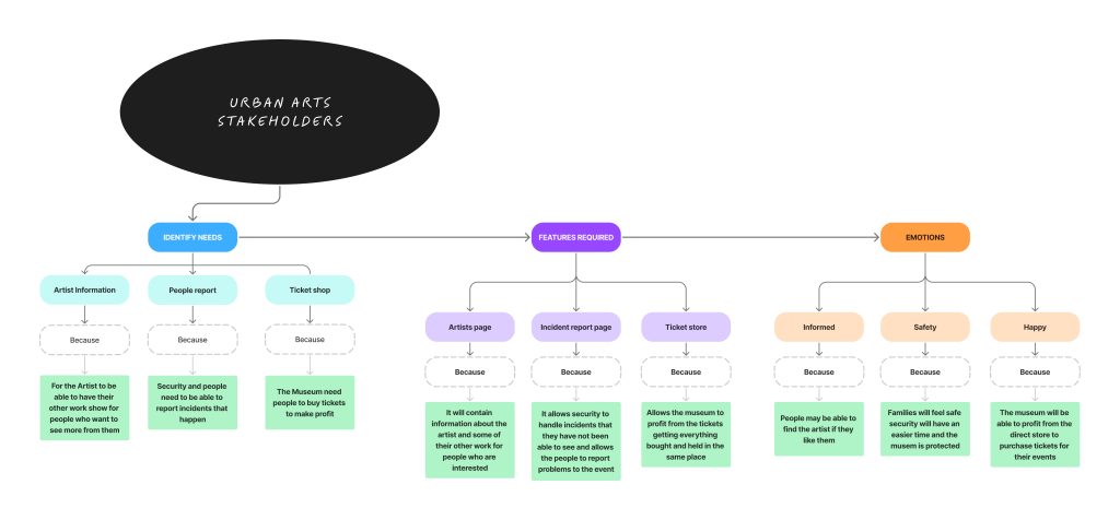
Target Audience and User/steak holder needs
User needs
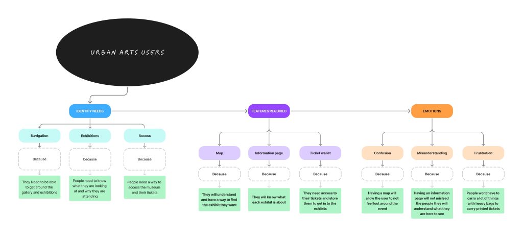
When looking at my user needs, I broke it down to three main things that they would want/ need for my museum app: a map , ticket wallet, and information page. I chose these three things as I thought they would be the most important things a map would satisfy users who are lost and trying to find their way around the exhibition, allowing them to navigate exactly where they want to be. A ticket wallet would allow them to leave all heavy bags at home, only needing their app with their downloaded ticket to show to get in. Also, having the ticket be purchasable in the wallet allows the user flow to take place quickly and seamlessly, making for a calm and controlled experience. Finally, an information page would allow the user to know what the exhibit is and allow them to feel less confused then going in blind, solving issues of unhappy users with the exhibit and users who feel less knowing little about it .
Steak-holder needs
The three conclusions I came to when looking at my steak-holder needs were : Artist page , incident report page, and a ticket store. These features, I think, benefit them the most. Artists get credit and get to show more of their work off in an information page, meaning that they get more exposure on them in general, not just the exhibit-specific work. Secondly, users can also find more about them. An incident report page allows the security of the event not only to have a private data collection having the incidents reported but having a public section allows the users to upload incidents the security doesn’t view and lets them know what’s going on throughout the exhibit, making both parts safe and allowing the security to perform their job more effectively. Finally, a ticket store benefits the museum as they can just scan a code on the ticket to know who’s who and which users have entered the exhibit, not needing extra charges as the payment process can be done in the app.