Ferens art gallery
Primary Photo
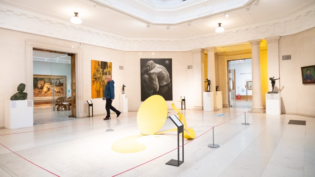
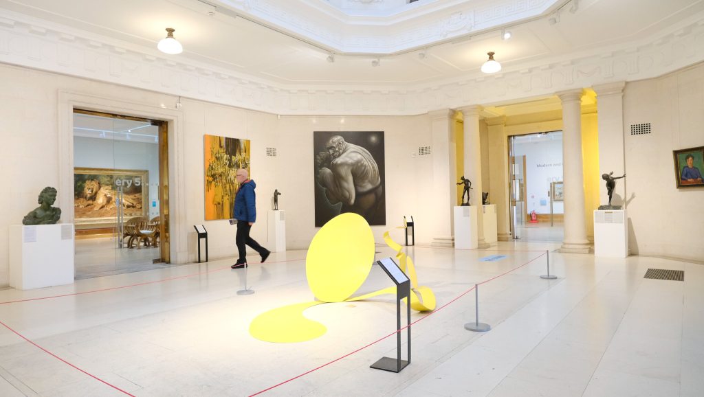
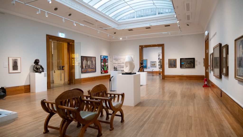
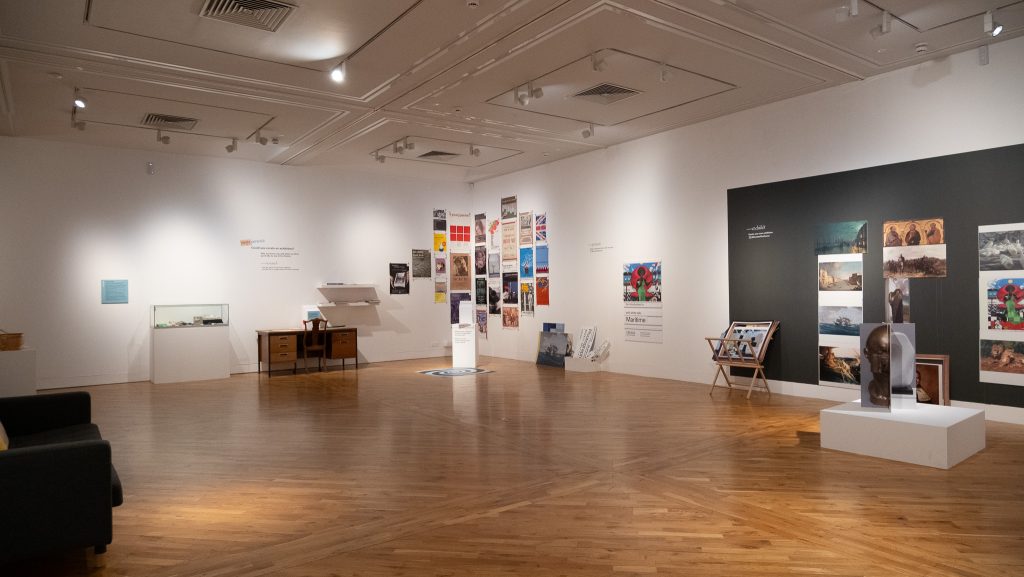
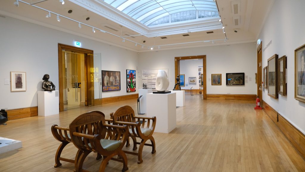
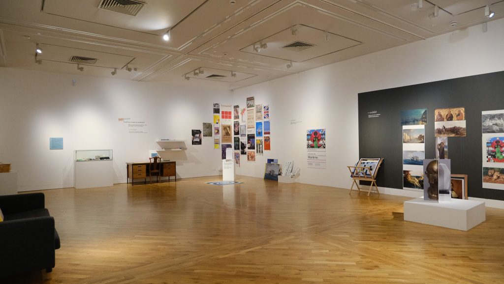
When going to Ferens art gallery I noticed a few things that are going to influence the style and aim for my museum app project. The layout while wondering through the museum I felt lost and was unsure of where I was going when taking photos, to add to this the organisation of the paintings and rooms did not feel very obvious to me leaving me unsure of what I was looking at. The information that was available by the pieces was not enough in my opinion and did not tell me what I wanted to know. The style of the paintings I the gallery as well I want my gallery to have a photography base not a traditional art medium.
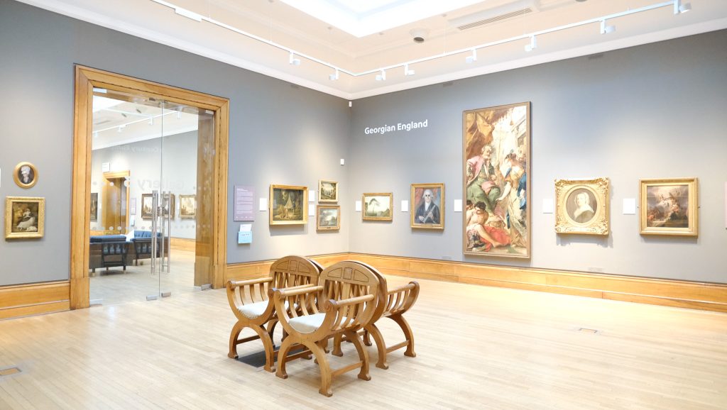
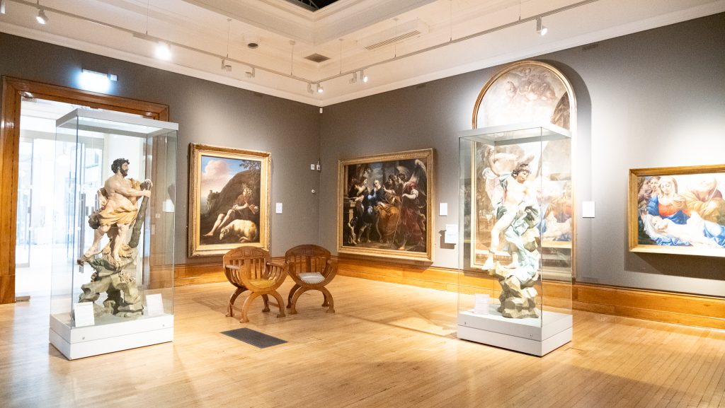
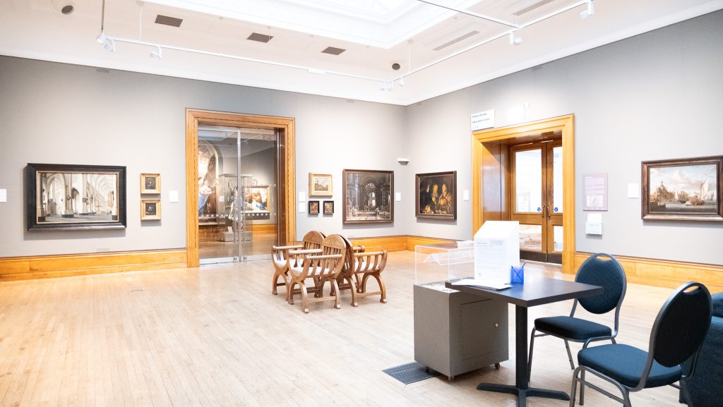
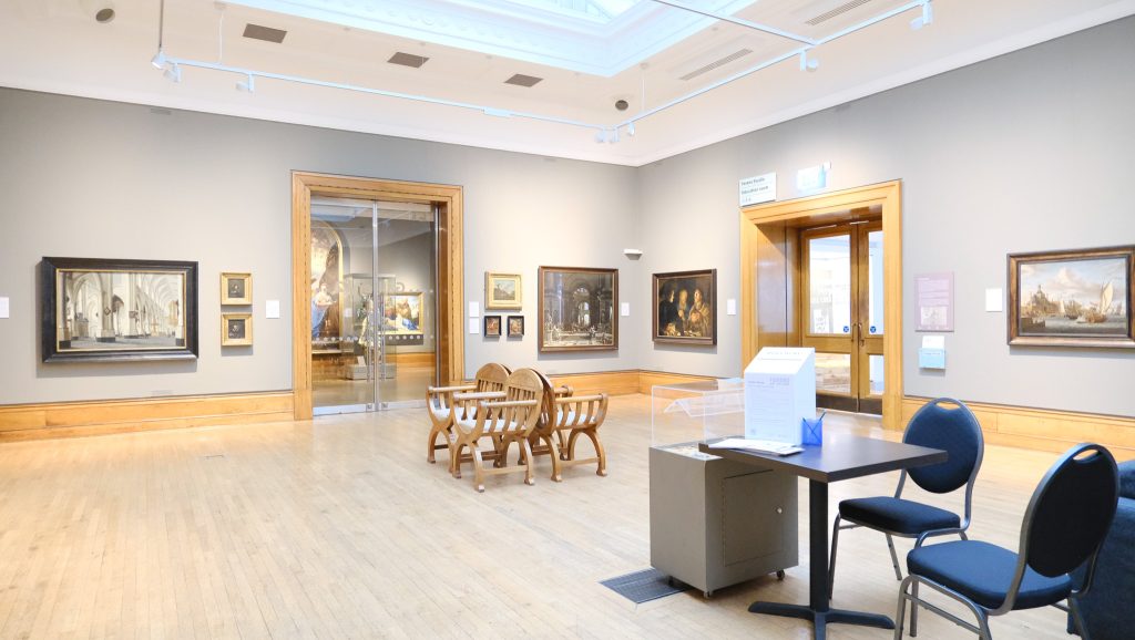
The style of the museum has also had influence on my ideas for my own museum, to start I think the blank walls was a good idea although I believe the walls should be lighter colours as it highlights the art qa lot more then with the darker colours in my opinion. The flooring I think is not the choice I want to have for my museum I think the wooden floor is not the right look for my plans while fitting the old style of the art displayed here I want to have a concrete floor for my own museum. The glass doors leave the visitors wanting to look into the next room more than at the art in that room so I will not be including that idea. Glass letting in natural light I think is a good idea allowing an open feeling to the place.
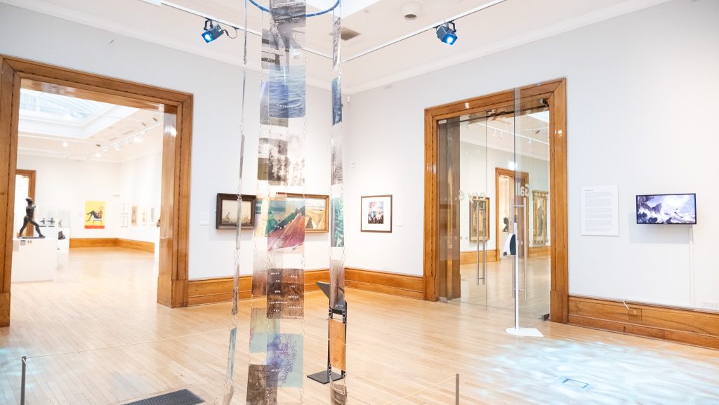
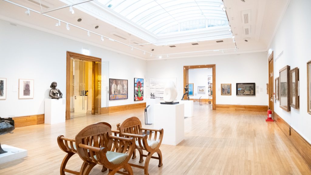
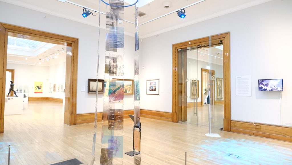
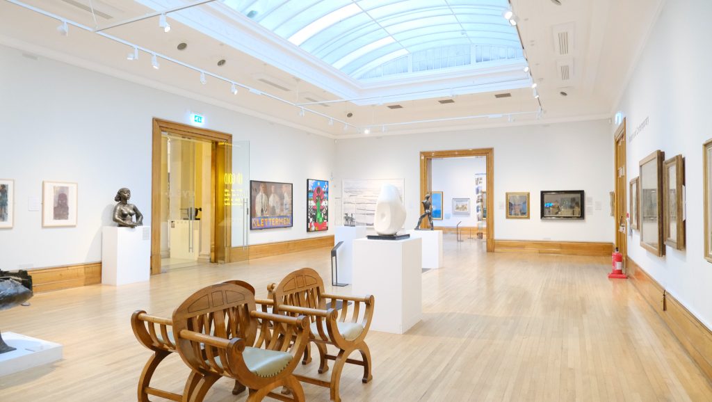
Visitors while I was in the museum showed me that when having a map feature is important not only for navigation of the exhibitions but for the seating while I was in the museum I frequently saw visitors leaning against walls or sitting in the chairs provided by the gallery. Having interaction like the donation boxes in this gallery and accessibility for deaf viewers and explanations for blind visitors is an important feature that I would like to think about when designing my museum.
What I will be thinking about on reflection from my research in the Ferens art gallery is accessibility, Organization of mediums, style and interaction for all different steak-holders. Accessibility in my museum and app I want to make it clear that the exhibitions will include options for everyone having thinks like headphones with recorded tours for blind people, Clear explanation and story information available for deaf people and information that is easy to read for people with colorblindness and over reading difficulties. When looking at organization of mediums I am going to make sure it is clear on the map for what section is which through use of graphic design and typography choices. Style I will be having a modern style with white walls and concrete floors to have the whole experience be about the museum. I want to take these ideas from my research and apply it to all areas of my app including the map, information pages and accessibility for all features.