Work
For this session I worked on My double page spread and the work around it I made files to organize all my work one file named “Graphic Design Fundamentals 2025” with four files inside. One for links with a word document containing the links for all of my resources including photos and fonts. A second for the resources in the work I have been doing. A third with the Exports of All My files. Finally a folder with all my working Files.
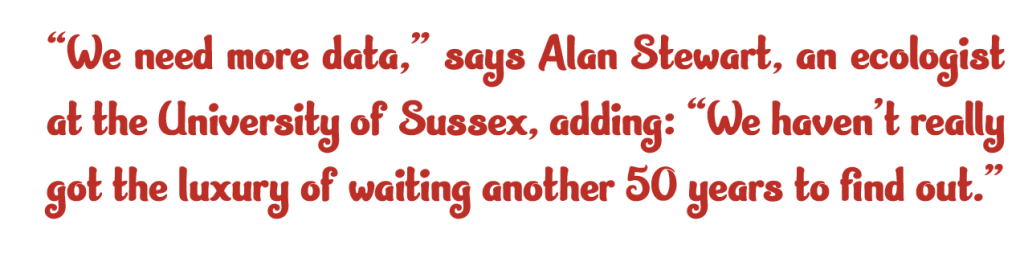
Once Creating my files I started to work on my Double page Spreads. I decided to work on the color scheme and ask for help with my current works for the spreads, I got the suggestion of varying some of my text and working on my cooler scheme Chaning my Quotes red to a green to fit more in the theme of nature as well as making the magazine be more friendly and actually legible to color blind people.
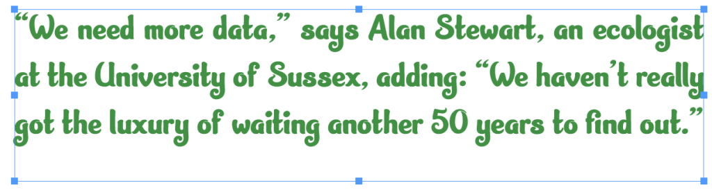
Once chasing these changes I started to work on my color scheme, I decided to have three colors fitting the theme and going together, I used the Colors website to generate colors and decided picking Three colors , Dusty Olive as the main colour for the spreads as I thought the green would match nicely with the natural theme in terms of fitting into nature. Egg Shell I thought that having a color that fits into the specific nature being in a large majority for birds Owls having the egg shell color fits into not only the story but another type of nature. Finally I had a shadow Grey to have a more neutral colour that I could fit into my spreads for the decks and alt text for my photo descriptions I wanted to have this color as it separates the features notably but when not concentration on them they are similar enough to not keep fixation.